
📦 Revised Cover Proof Copy Has Arrived
■ Overview
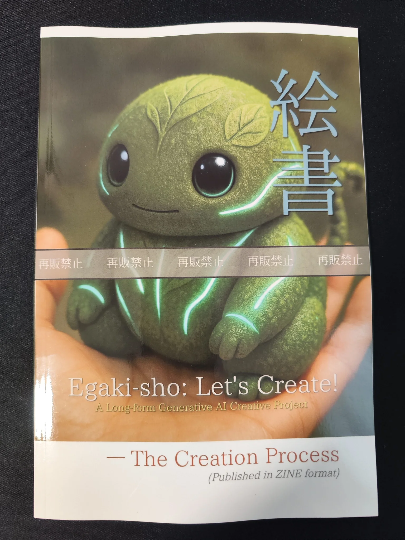
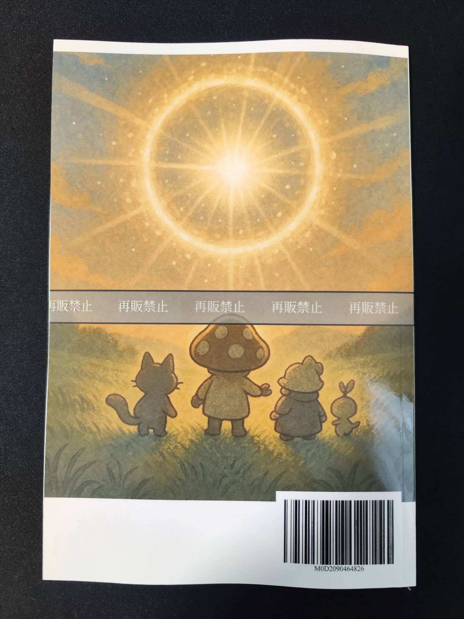
The KDP paperback proof copy of the English edition of Egaki-sho: Let’s Create! ZINE — The Creation Process has arrived.
Following the cover issues I noticed in the previous proof copy, this time I checked a revised version with adjusted front and back cover image placement, as well as an improved spine treatment.
After seeing the physical copy, I felt the revised cover had reached a satisfying result, and I am glad I made the changes.
 |  |  |  |
■ Purpose
The main purpose of this proof copy was to confirm the following points:
- whether the revised front and back cover images would visually reach the edges more naturally in print
- whether the added line on the spine would function well as part of the physical book design
- how the English edition would feel on paper in terms of text density and overall layout pressure
This was meant to confirm how much the improvements from the previous proof copy had enhanced the final result.
■ Background
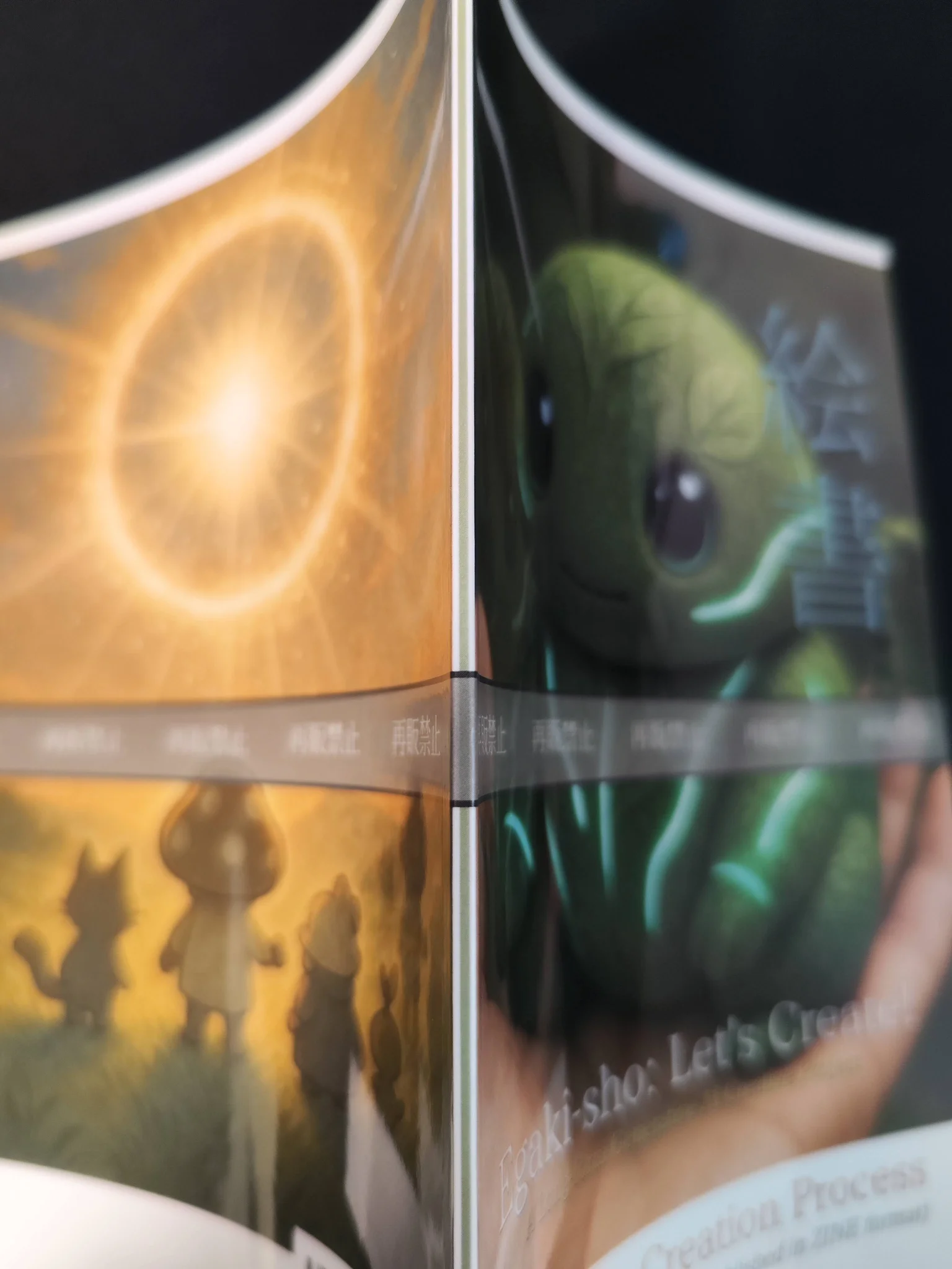
In the previous proof copy, the front and back cover images appeared to stop slightly inward from the edges.
For this reason, I revised the cover data by:
- extending the front and back cover images further toward the outer edges
- adding a colored line to the spine area
After making those adjustments, I ordered a proof copy of the English edition, Egaki-sho: Letʼs Create! — The Creation Process.
As for the interior layout, I did not make any major revisions this time, since the priority was to confirm the finish of the revised cover first.
■ What I Did
1. Checked the revised cover proof copy
The KDP paperback proof copy of Egaki-sho: Letʼs Create! — The Creation Process arrived, so I checked it right away.
This time, the effect of the cover adjustments was immediately clear.
- I was able to confirm that the front and back cover images now visually reached both outer edges
- I was able to confirm that the spine line appeared properly and cleanly
Compared with how it looked on screen, the effect of the revisions became much easier to understand in the physical copy, and the overall design felt more cohesive.
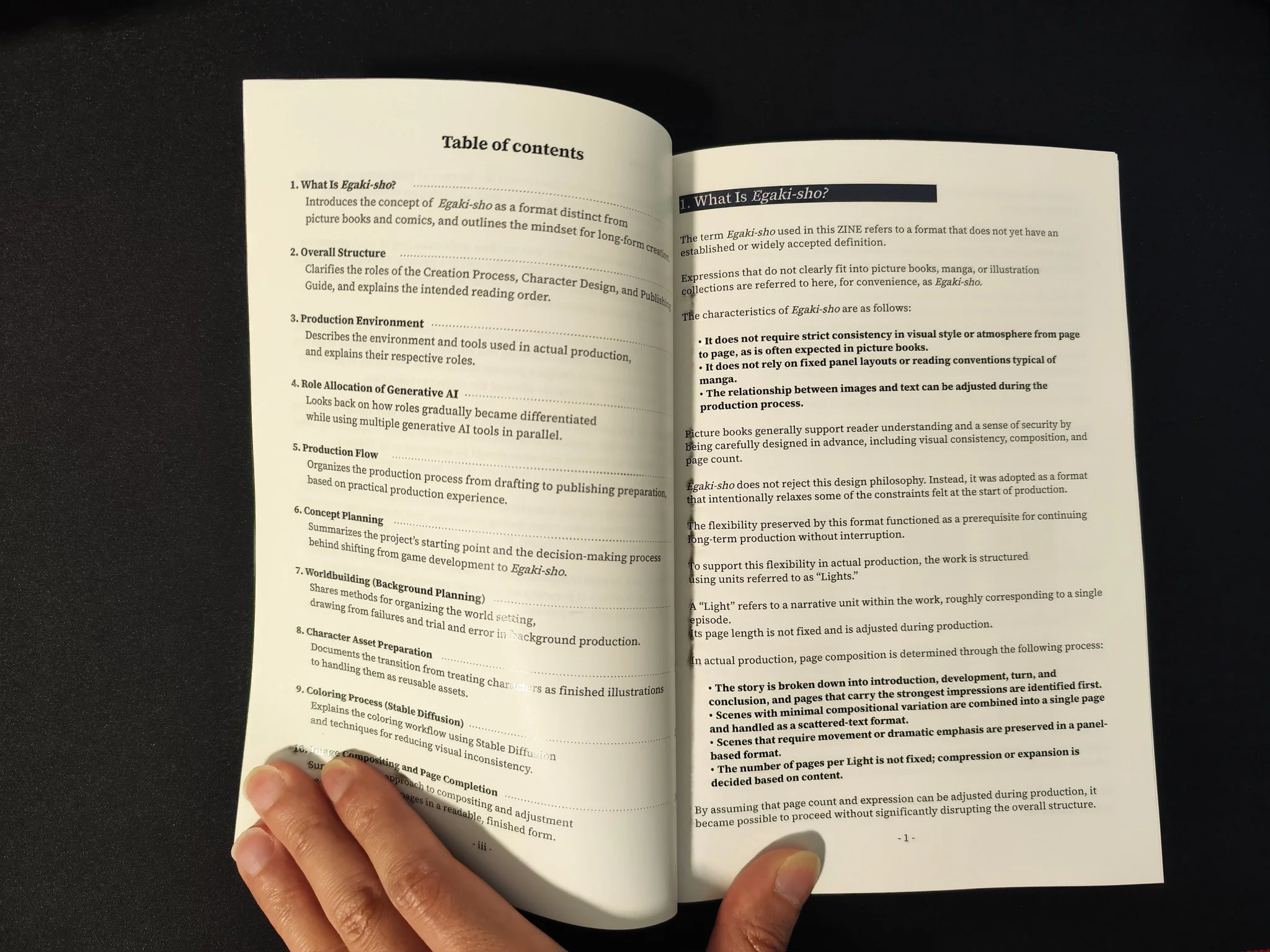
2. Checked the impression of the English interior layout
At the same time, I also checked how the English edition looked as a printed book.
Seeing the English edition physically printed for the first time, I felt a slight sense of text density compared with the Japanese edition.
It was still readable, but it made me feel that future English editions should be designed with even greater attention to:
- margin balance
- breathing room between lines
- the relationship between text volume and layout structure
■ Results
This proof copy confirmed that the direction of the cover revisions was the right one.
The two biggest outcomes were:
- the front and back cover images now appeared to reach the edges more naturally in the printed copy
- the added spine line improved the overall sense of unity and completion
At the same time, the English interior text felt slightly tighter on paper, which made me feel that margin design should be considered even more carefully in future work.
■ Notes
This check confirmed that the cover has now reached a finish I feel satisfied with.
It was especially valuable to take the sense of discomfort I noticed in the previous proof copy, apply actual revisions, and then confirm the result again in print.
Also, because English layouts are more easily affected than Japanese ones by text volume and line breaks at the word level, I felt that future PDF layouts should be designed from the start with more breathing room in mind.
With this, I would like to consider the submission and proofing process for both the Japanese and English series of Egaki-sho: Let’s Create! ZINE complete.