
📦 First KDP Proof Copy Has Arrived
■ Overview
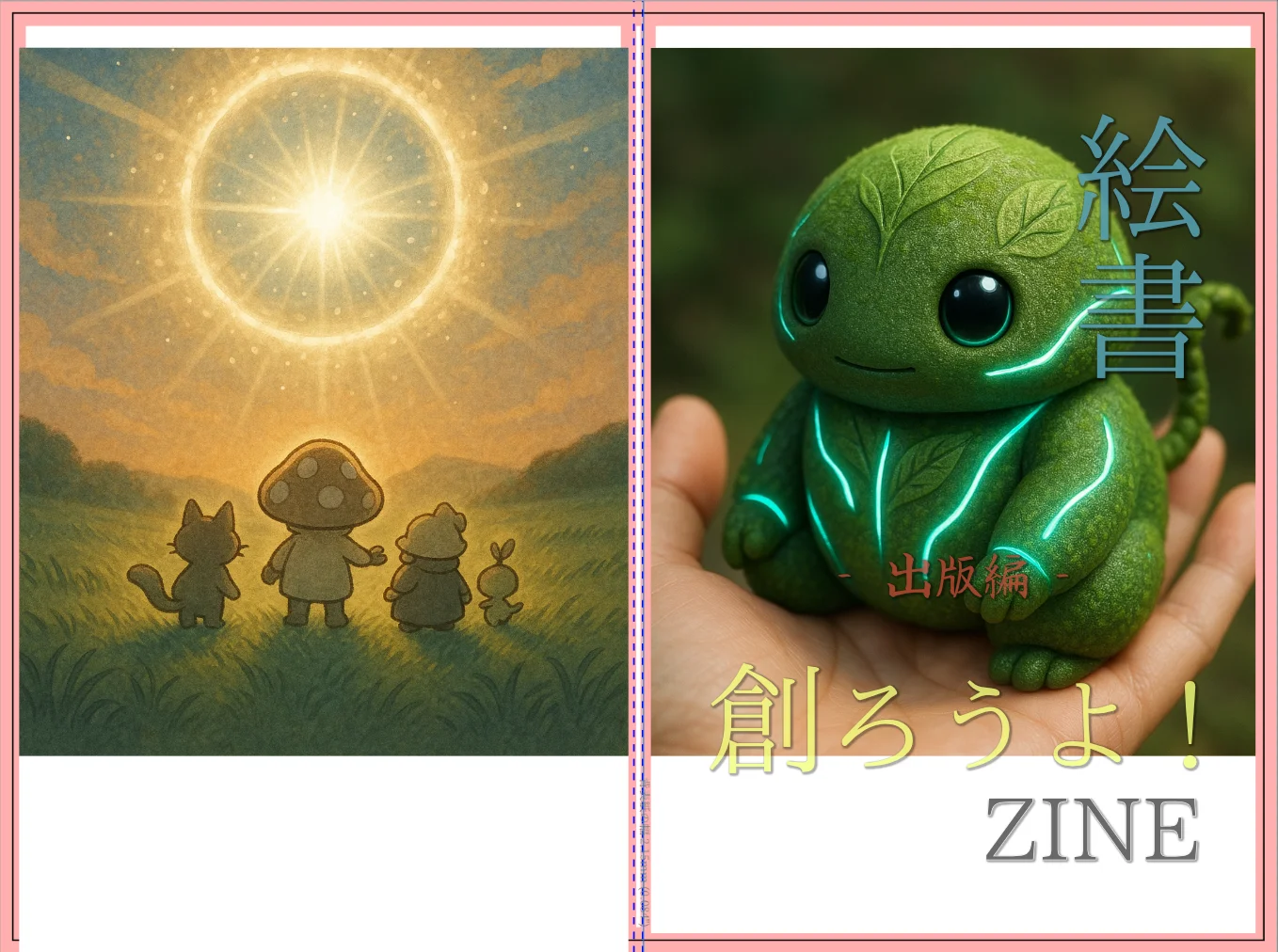
The KDP paperback proof copy of Egaki-sho: Let’s Create! ZINE — The Creation Process has arrived.
This was the first time in my life that I was able to hold a physical proof copy of my own book in my hands.
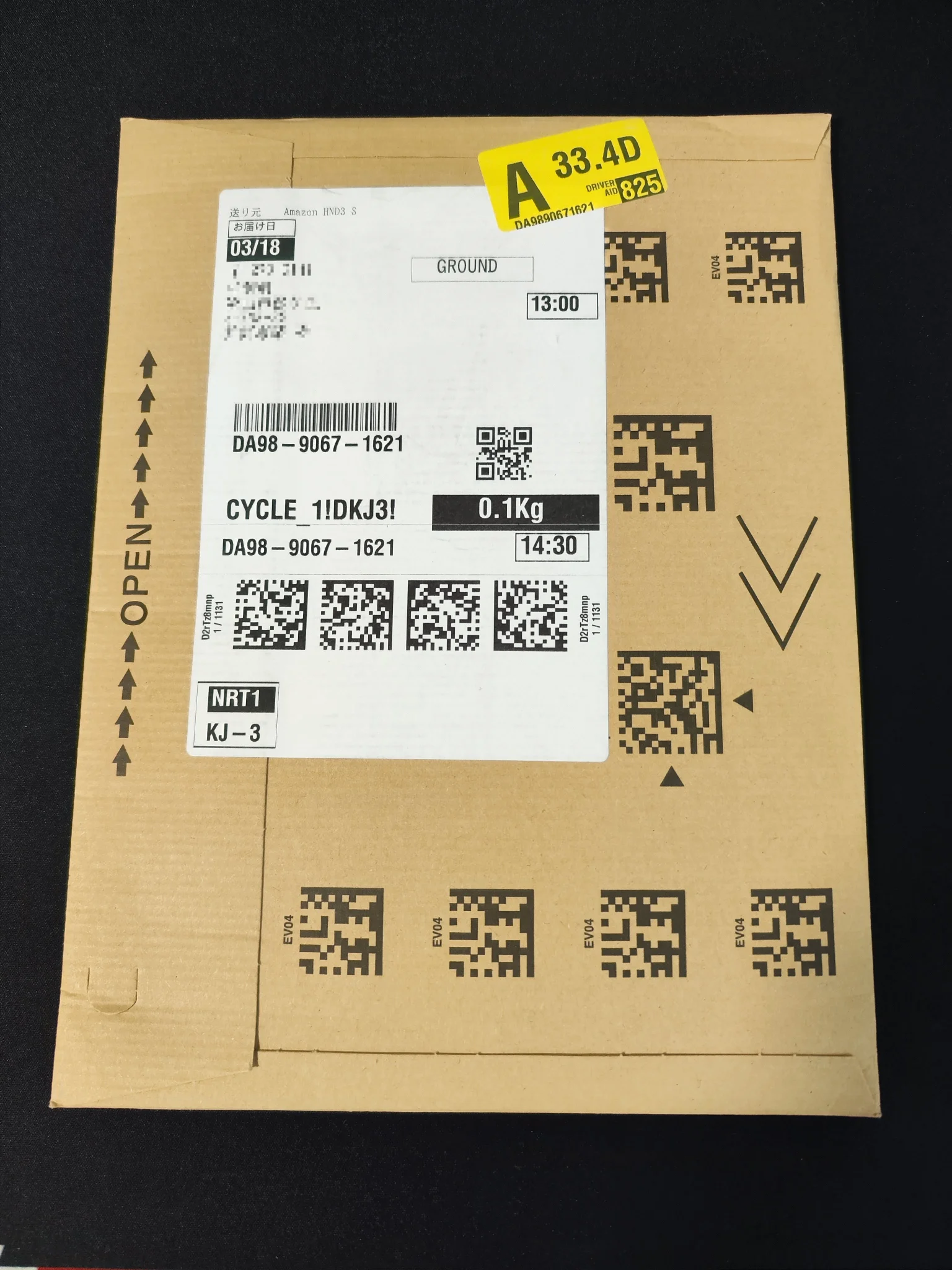
- It arrived in an Amazon envelope
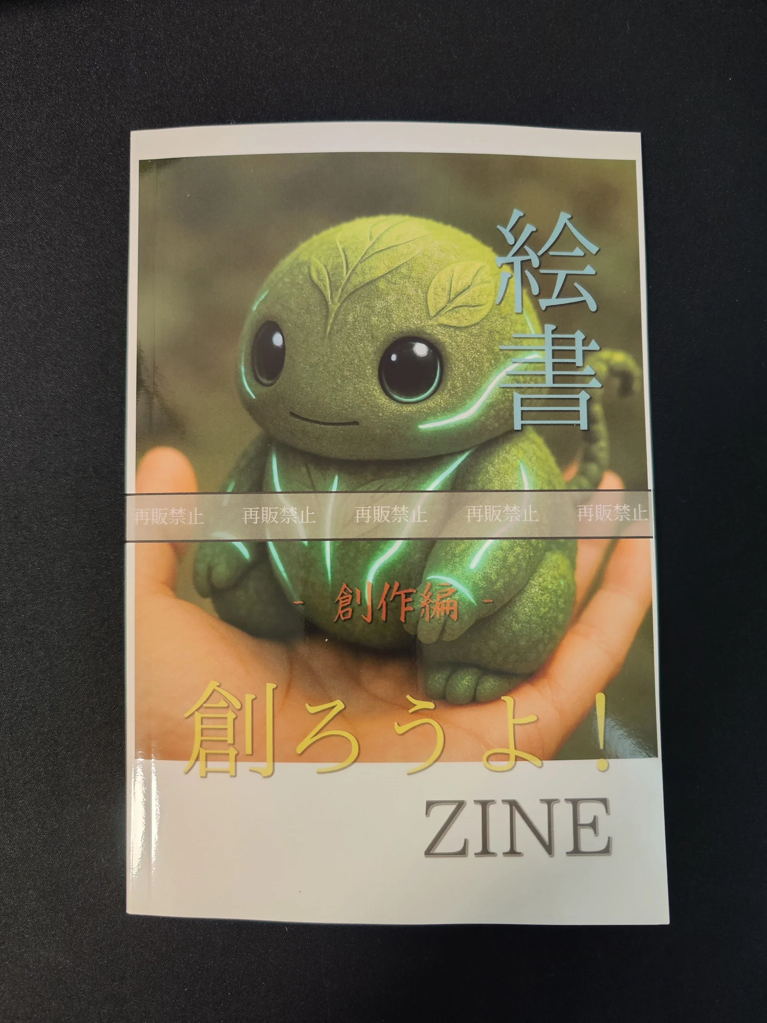
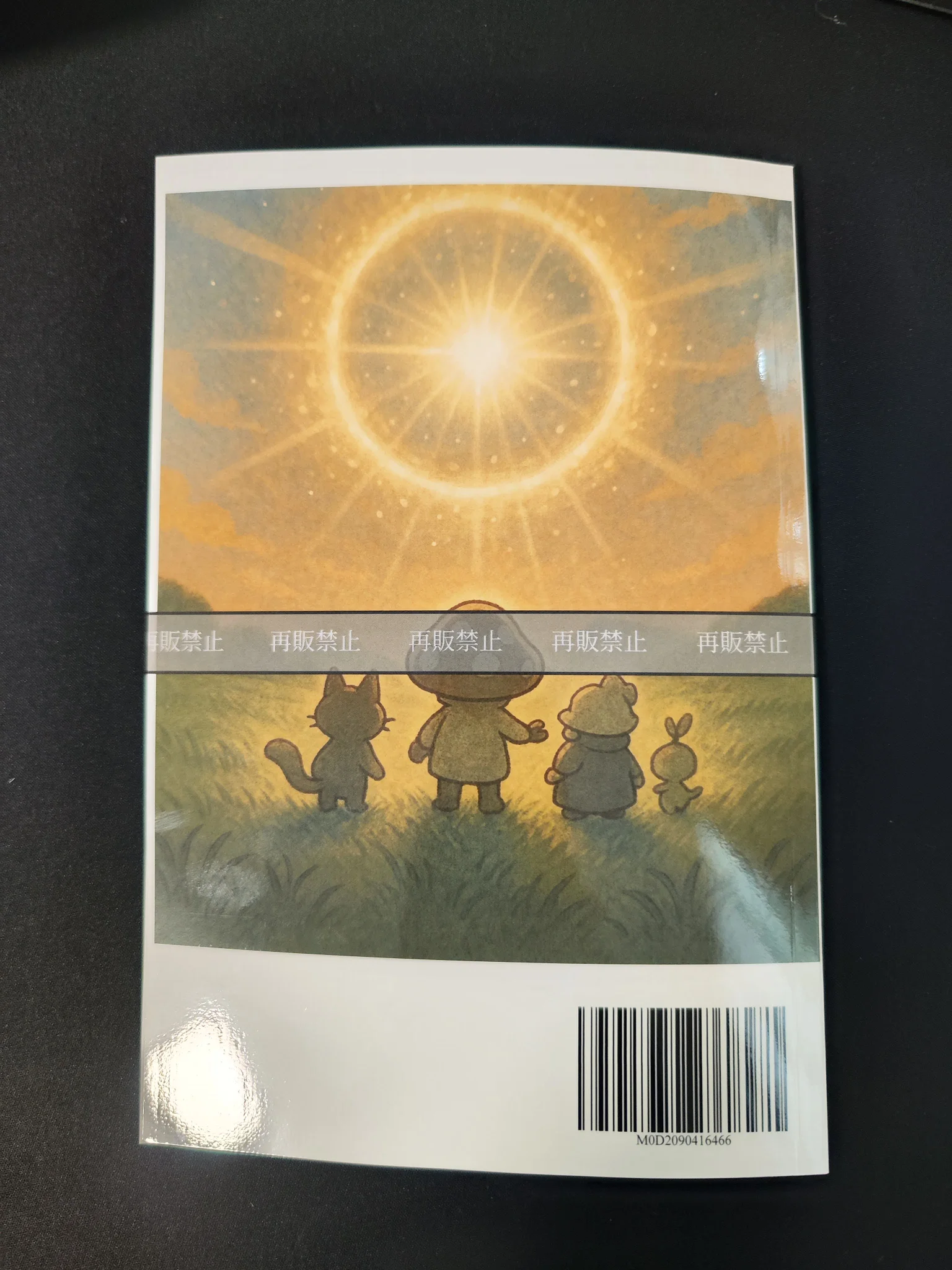
- Both the front and back cover looked properly book-like
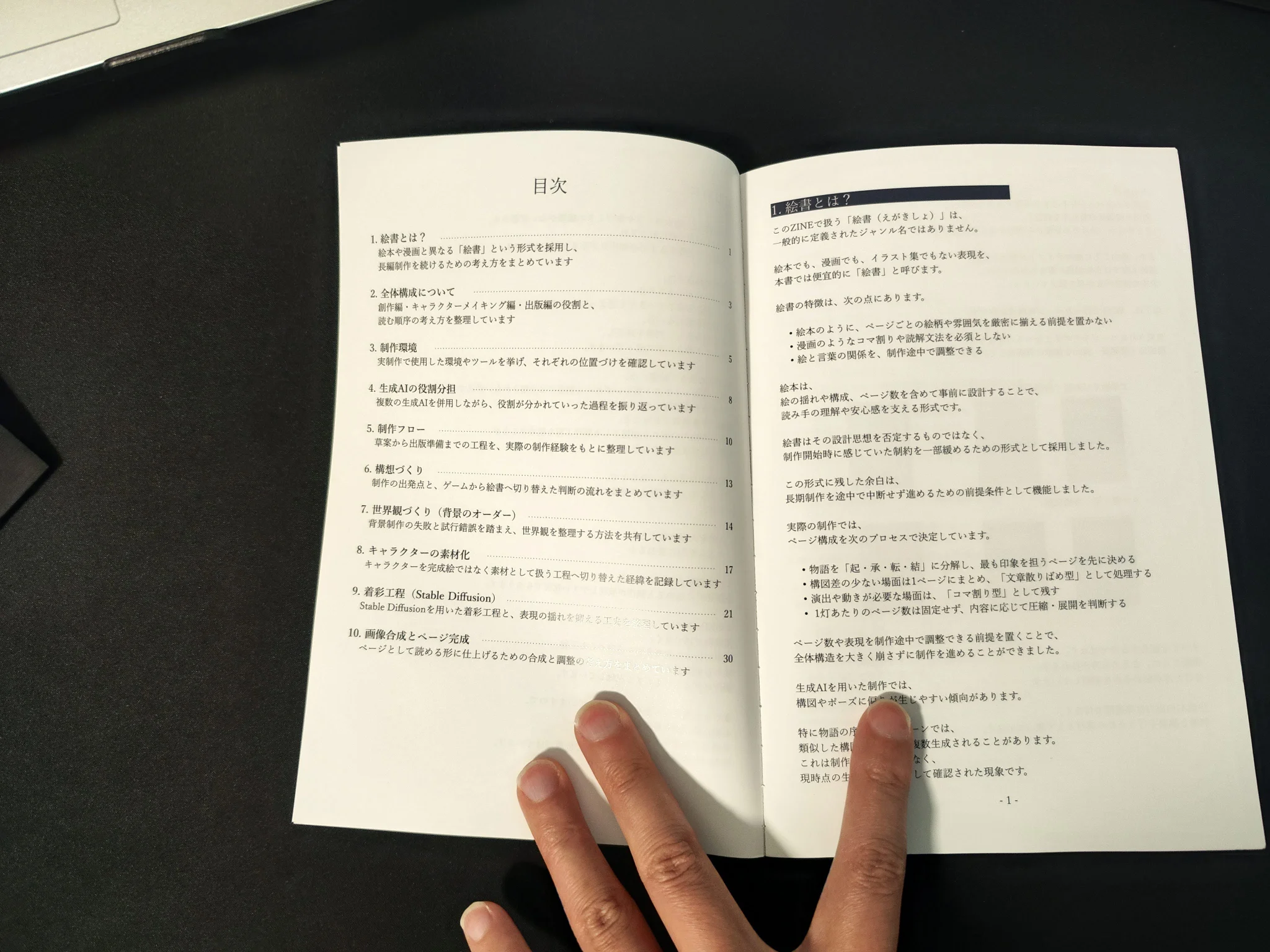
- The table of contents spread was even easier to read than I had expected
I was genuinely happy to see that it turned out to be such a solid-looking book.
 |  |  |  |
■ Purpose
The purpose of this proof copy was to confirm how the book would actually look as a KDP paperback, especially in terms of:
- the appearance of the front cover
- the appearance of the back cover
- the impression of the inner margin near the gutter
- the readability of the body text
■ Background
For this edition, I used the same page margins as the PDF version, partly to keep consistency with the English edition as well.
- Inner / outer margins: 12 mm
- Top: 15 mm
- Bottom: 18 mm
The cover was created using KDP’s cover creation tool.
Since many aspects of the final result are difficult to judge accurately on screen alone, I decided to check the physical proof copy first.
■ What I Did
1. Checked the proof copy
The KDP paperback proof copy of Egaki-sho: Let’s Create! ZINE — The Creation Process arrived.
Seeing the physical book was genuinely moving.
It looked much more like a real published book than I had expected. Rather than feeling like a self-made booklet, it had the presence of a small professional textbook or technical guide, which made me strongly feel the power of print.
2. Organized the issues I noticed
After checking the physical copy, two main points stood out:
- The inner margin near the gutter felt slightly tight
- The cover and back cover images did not appear to reach fully to the edges
As for the gutter side, the book was still readable, but I felt that around 15 mm would have given the layout a more comfortable feel in print.
As for the cover image, I had placed it conservatively within the KDP template’s safe area, but in the actual printed copy it ended up looking slightly pulled inward from the edges.
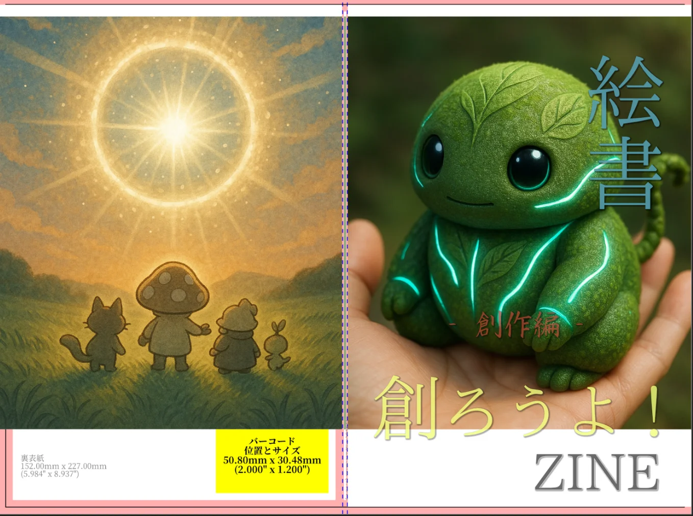
3. Revised the cover data
After checking the proof copy, I immediately revised the cover layout.
- Extended the front and back cover images farther toward the edges
- Added a colored line to the spine area for each volume
- Creation Process: green
- Character Design: orange
- Publishing: blue
Comparing the before and after versions, the added spine treatment made the overall design feel much more cohesive.
| Before revision | After revision |
|---|---|
 |  |
| The images did not visually reach both outer edges | The images were extended toward the edges, and a colored line was added to the spine |
■ Results
This proof copy allowed me to confirm the real physical feel of the KDP paperback.
The biggest takeaways were:
- I could finally understand the actual feel of the gutter-side margin, which is hard to judge on screen
- Cover images appear more inward in print than they seem on screen
- Even a small adjustment to the spine area can greatly improve the overall sense of completion
At the same time, I decided not to revise the inner margin for this edition.
Because of the relationship with the PDF and English editions, changing it now would affect too many parts of the layout.
■ Notes
One clear lesson from this proof copy is that, for paperback editions, the gutter-side margin should ideally be designed from the beginning with 15 mm in mind.
This is something that should be built into the layout at the PDF stage, rather than corrected later.
I also felt that the English edition is more likely to become layout-tight than the Japanese edition, so from now on I need to calculate margins while already anticipating the expanded layout after translation.
■ Next Step
Now that I have revised the cover, the next step will be to order a proof copy of the English edition of the Creation volume:
Egaki-sho: Let’s Create! — The Creation Process
That will let me check how the revised cover design actually looks in print.